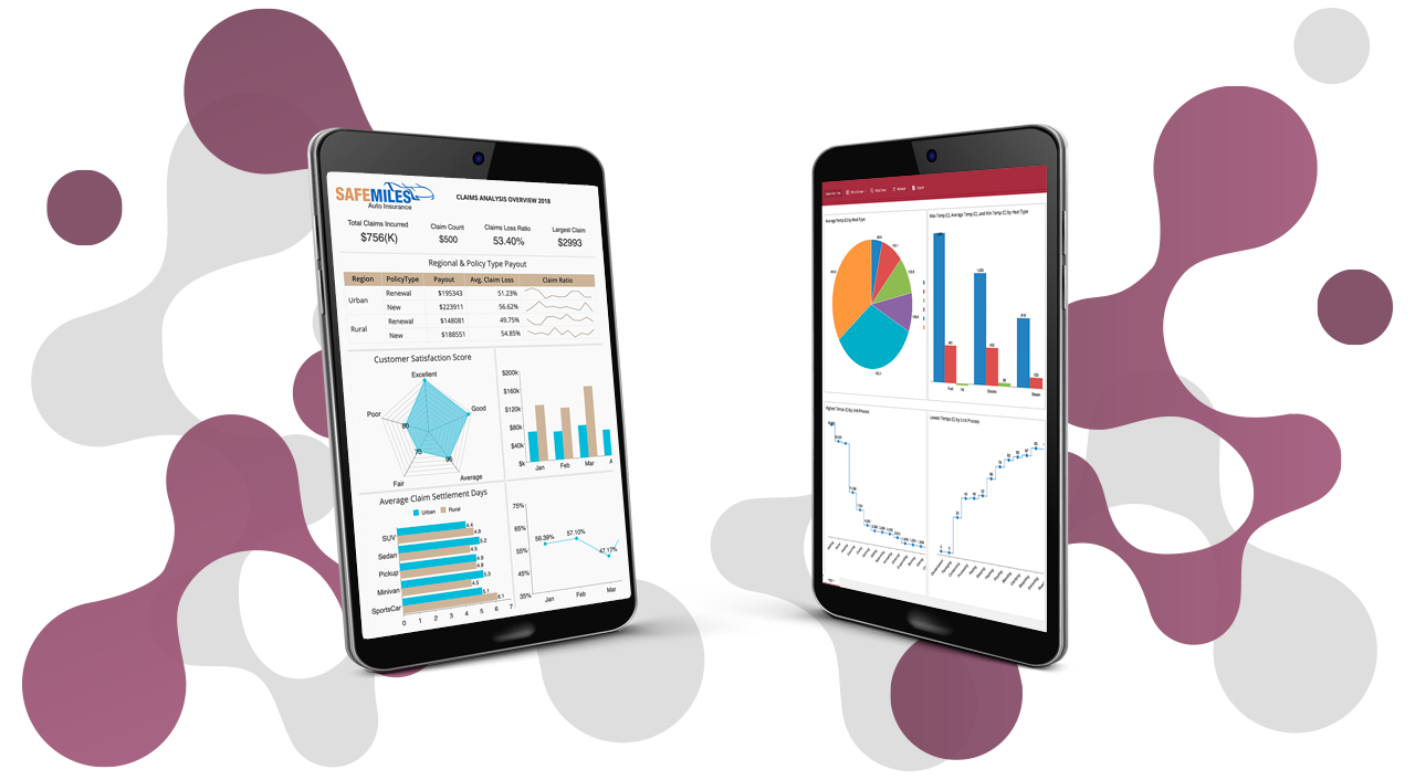
A business intelligence (BI) dashboard is an interactive visualization method for displaying different types of data for business operations on various scales. BI dashboards can be used to convey all kinds of data to help drive the organization's overall success through influencing decisions.
The types of data typically found in BI dashboards are analytics metrics, key performance indicators (KPIs), and other data points that play a role in decision-making.
Here, we'll focus on a CEO dashboard. We'll explore our five-part CEO dashboard example and focus on the critical aspects of different departments that will benefit from CEO-level data. Our CEO dashboard consists of the Sales, HR, Project Management, and Marketing departments. We'll highlight the essential KPIs and metrics needed for leadership.
What is a CEO Dashboard?
A CEO dashboard provides executives with high-level KPIs and metrics at a glance to monitor business performance to make agile, data-driven decisions.
In our five-part CEO dashboard, the first tab provides an overview of the primary department's KPIs. You can then tab over and drill further into each department by year with associated, individual dashboards.

CEO Dashboard Metrics and KPIs
Metrics that you would include in a CEO dashboard:
- Net profit
- Expenses
- Total revenue and sales targets
- Employee engagement
- Profit per customer
- Order fulfillment cycle times
- Revenues and revenue growth rate
- Labor cost
Once the main KPIs are established, you can tab over to drill through each department for greater insights into each department.
Additional questions that can be answered:
- How many customers did we lose/gain this year?
- What two products were most often bought together?
- How long was the typical evaluation time per product?
- What is our employee engagement?
- The number of projects vs. completed projects
- What are the marketing conversion rates and conversion costs per year
Benefits of a CEO Dashboard
Visualizes All Departmental Data
A CEO dashboard provides executives valuable visibility and insight to make data-driven decisions. In one interactive dashboard, you can review total revenue, costs (per department), employee productivity, and overall marketing conversions.
CEO dashboards provide data trends within one location showing an unbiased view of the company's performance overall and as well as within each department. This data knowledge allows for continuous improvement, empowering management to make informed decisions.
Saves Time and Eliminates Data Silos
Many executives spend a considerable amount of time logging into portals, applications, spreadsheets, CRMs, and website analytics to run reports. This reliance on different data sources can create data silos. When data silos exist, there is no single source of truth, and data can quickly become outdated, leading to inaccurate intelligence or insights. In this case, you may not efficiently identify various financial or economic patterns. Additionally, when you are manually manipulating data in any way, it leaves room for human error.
Using a real-time CEO dashboard, you will always have the latest results. The C-suite can gain insight into overall performance by drilling down into the data and using visualizations to make more informed decisions.
Access to Multiple Data Sources
If you need to visualize data from multiple sources in one location, a CEO dashboard can gather multiple data sources together to show a single source of truth.
For example, several data sets are connected in the Wyn CEO dashboard over a five-year period. Of course, you can review the main KPIs; you can get a comprehensive look inside each department as you drill through. Multiple data sets are connected, quantifying metrics for a year-over-year comparison. With this dashboard, management can easily measure their performance against the goals set in the company's strategic plan.
Better Decision Making
CEO dashboards provide insights for multiple departments and offer a foundation for further dialogue and enhanced decision-making.
For example, the sales and marketing department can align their data and experiences with increasing customer acquisitions and improving demand generation. Sales and marketing can compare year-over-year trends to gain insights about ad spend vs. conversions, web traffic, customer lifetime value, and more.
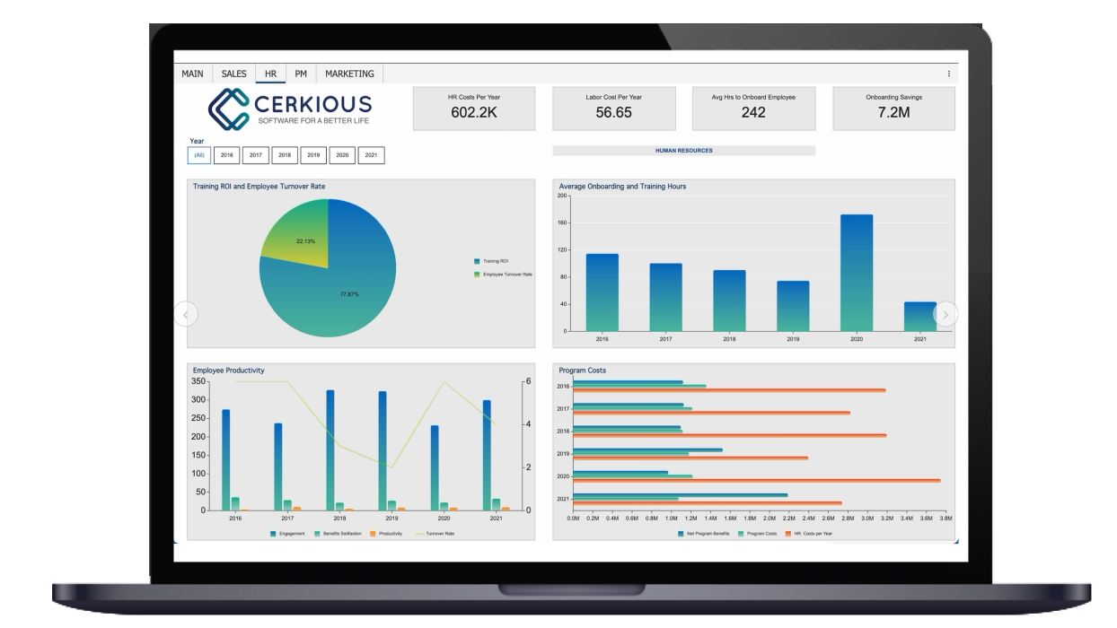
Human resources can better understand employee data with a CEO dashboard. HR can align with executive management to better understand HR costs per year, the average time it takes to onboard an employee, training ROI, average employee turnover rate, employee engagement, and productivity.

Business Intelligence CEO Dashboard | HR
CEO Dashboards - Final Thoughts
Recent studies state that 90% of the world's total data was generated within the last two years. This has plunged many organizations into an information overload, consequently, the need to have more intelligent, intuitive means of analyzing and interpreting data is needed now more than ever.
By leveraging data analysis tools, you will gain access to insights that will help you develop strategies based on real-time data.
With embedded business intelligence dashboards, executives can get up-to-date, relevant data at their fingertips so they can make proactive decisions.
Wyn Enterprise is an embedded BI platform that provides greater insight into your data. Wyn offers built-in tools for report and dashboard creation, security integration, automated document distribution, and a business-user-friendly interface for self-service BI.
Embed Turnkey BI Dashboards & Reports
Eliminate data silos with real-time interactive business intelligence dashboards and reports.
To learn more, request a demo with one of our embedded BI experts or request a free15-day free trial.


