Business intelligence (BI) is centered around business growth, driven by decisions inspired by and supported by data. When data is formatted and presented in a manner made for quick analysis, it easy for decision-makers to interpret and make decisions that benefit the bottom line.
Fundamentally, sales is the core of any business. Sales analysis is commonly performed against sales data to measure efficiency, revenue, profit, trends, predictive insights, and more.
Products that sell the most need be identified and monitored to maintain their success, while products that struggle to sell need action plans to improve metrics. Managing inventory, determining discounts, limited time offers, basket analyses, and more are critical aspects of a sales-oriented business.
Businesses know the metrics they need to make informed decisions. Sales-dependent metrics such as gross revenue, profit and loss percentages, and cost of goods sold determine business decisions and outcomes. In a typical database, these metrics are not calculated on a row-level. As a result, these metrics must be calculated for business users, externally from the database, for end-users to make informed decisions.
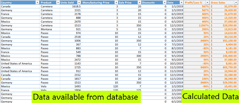
Technical users in any BI system must have a way to dynamically calculate these metrics which are not available on the record level of the database. Wyn Enterprise offers an advanced visualization in Wyn Dashboards to meet this requirement: Calc Charts.
Introducing Calc Charts
Calc Charts in WynDashboards enable users to dynamically perform calculations on their data for presentation in a dashboard. It provides a semantic layer for calculations and lets users model their data for quick ad hoc analysis. The data for these charts comes from dataset aggregation and manual user input.
The Calc Chart can be used by technical or non-technical users to perform analysis on data by converting it into a comprehensive format to support their decisions or conclusions. Users can:
- Make dynamic calculations with data from a dataset, or data manually entered by the user
- Model raw data and calculated data in specific formats such as percentages and ratios
- Extrapolate the calculated values to generate future values
- Present the calculated data visually through a variety of different charts
Getting Started with Calc Charts
The Calc Chart is available in the Dashboard Designer Visualization Panel as shown below:
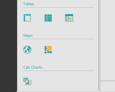
The initial UI looks like other visualizations, except in the Calc Chart the user generates the dataset manually.
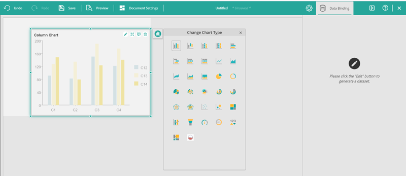
As mentioned on the Data Binding panel, generate data for the Calc Chart by clicking the Edit button on the chart. This will open an editor:
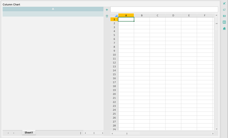
The editor consists of three panels:
Aggregation panel
This panel on the left shows the data aggregations in the form of a pivot table from an existing Wyn Dataset. Bind aggregations from datasets to the sheets in the panel. Add multiple sheets to fetch data aggregations from separate datasets. Remove any pivot sheet to remove the datasets not required for the calculations.
Calculation panel
This panel on the right consists of a spreadsheet that allows the user to calculate the desired metrics. Enter data/text in the cells of the spreadsheet manually, or copy data from the cells of the pivot table (read below on how). Copy data from any text editor or a spreadsheet (e.g., Excel) and paste it into the spreadsheet here for seamless visualization.
Visualization panel
This panel visualizes the data selected in the Calculation panel. By default, this panel is not visible, but when a data range is selected as a data source for this visualization, it appears at the bottom as shown below. This visualization displays the automatically-generated measures and dimensions for the Calc Chart to use in the Data Binding panel.
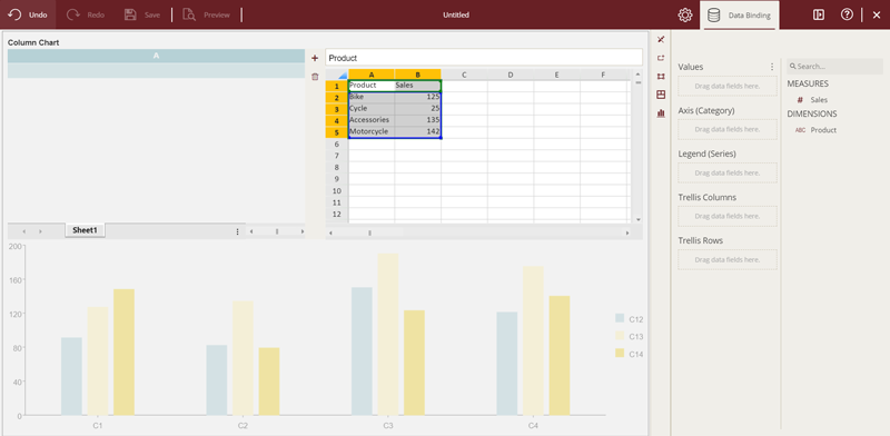
Calc Chart options are found beside the calculation panel in the editor:
These options, in order, allow the user to:
- Exit the Calc Chart Edit mode
- Select the data range for the visualization
- Display the current data range
- Choose the editor layout
- Choose the visualization type
Below are the features and specific properties and functionalities of the Calc Chart.
Features Supported by Calc Charts for Ad Hoc Calculations
Calculations in Calc Chart can be performed on manually entered data, using data from the dataset or a combination of both.
To get data from a dataset, bind the Pivot with a dataset as suggested in the data binding panel when Calc Chart enters its edit mode.

Once a dataset is bound to the pivot table, a pre-defined function "GETPIVOTDATA" is used in the spreadsheet to reference a cell's data from the pivot table. Automatically create this function by selecting a cell in the spreadsheet, typing "=", and selecting a cell in the pivot table.
The general syntax of the function is:
GETPIVOTDATA(measure name, sheet name, [dimension name, entry name of dimension],...)
Where:
Measure name is the value item's display name for the pivot.
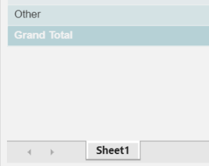
Sheet name is the name of the sheet containing the pivot table for reference.
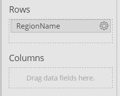
Dimension name is the row or column grouping item's display name for the pivot table.
A dimension's Entry name is the related dimension (or grouping) value for a selected value in the pivot table.

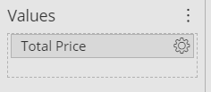
Ex. The function =GETPIVOTDATA("Total Price","Sheet1","RegionName","United States") will fetch the selected cell value as shown below:

Alternatively, a single cell value or a range of cell values selection can be made in the pivot table and simply copied and pasted onto the spreadsheet directly as shown below:

The user can always modify the initial data, make further calculations, and extrapolate the calculated values to generate future values for the desired visualization.
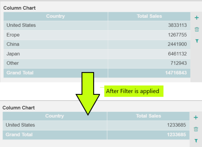
Filtering the Pivot Table
- The Aggregation panel allows the user to filter out the data that is required for the calculations using the filter option.
- Add as many filters as needed to focus on a particular metric.
- Filter a large dataset down to a specific row as needed, as shown below:
Excel Functions
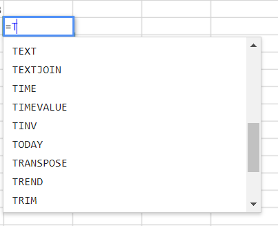
The spreadsheet component gives users a complete Excel-like experience. If features native support for built-in formulas, conditional expressions, and the insertion/deletion of rows and columns. Make any manual calculation and manipulate data with the help of mathematical, text, date/time, and other functions.
Calc Chart Measures and Dimensions
Once the data calculations are done and ready to be visualized, select the data range to be used by the visualization as the data source. Selecting the range of data generates a dataset in the Data Binding panel with textual and date/time values as Dimensions and numeric values as Measures.
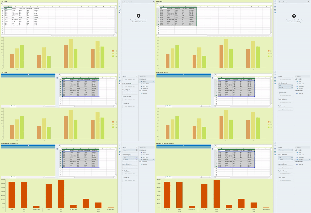
Next, rename and remove these measures and dimensions. There are no other functions available for these fields since the data is already manipulated and aggregated.
Calc Charts Inspector Properties
Just like standard visualizations, the Calc Chart has a list of properties enabled for configuration purposes in the Inspector tab. Customize the look and feel of the visualization display from here. Some properties, like Auto Refresh, are not available to preserve the custom calculations done on the Calc Chart.
Properties Specific to Calc Charts
Remove Empty Cells
This provides the capability to remove null values from the visualization that may occur in the spreadsheet such as unresolved formula cells or no data in selection. It offers multiple options (see below).
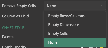
Each option has its own purpose.
None
Choose this option to keep all empty cells
Empty Cells
Exclude any empty cell, whether an empty value or group, from being presented on the chart.
Empty Dimensions
Exclude the rows/columns groups that have no data from being presented on the chart (see below).

Empty Rows/Columns
Remove the data rows/columns having empty rows/columns groups as well as empty values (see below).

Column As Fields
This property lets the user decide how they want to consume the data fields generated from a Calc Chart dataset. True resolves Calc Chart data range as a Wyn Dataset and the generated fields can eventually be used across the Dashboard such as in Parameters or Jump to Actions. False resolves the data range as simple data columns that can be used only as measures and dimensions in the Calc Chart.

Interactivity
Like all other visualizations in WynDashboards, Calc Charts support various user interactions like cross-filtering, sorting, exporting, and more. However, some actions are intentionally limited to these interactions (e.g., only Manual Sort is available) owing to the dynamic nature of the Calc Chart.
Using Multiple Datasets in One Calc Chart
The Aggregation panel allows users to add multiple pivot tables, where each pivot table can be bound to the same or different datasets. The spreadsheet can reference any pivot table allowing the user to calculate various metrics from multiple pivot tables in a single environment.
Calc Charts were designed and implemented to allow technical and non-technical users alike to dynamically calculate and visualize their own custom metrics. You can read this article for a specific example using a Calc Chart.
Understand the Story Behind Your Data
Wyn is a web-based BI and data analytics platform that provides greater insight into your data.
Wyn offers built-in tools for report and dashboard creation, data governance, security integration, embedded BI, automated document distribution, and a business-user friendly interface for self-service business intelligence.


