New Wyn Data Visualizations Include:
- Range Chart
- Pareto Chart
- Force Directed Graph
- Quadrant Scatter Plot
- KPI Cards
- Box and Whiskers Plot
- Bing Map
- Organization Diagram
- Waterfall
Embedded Data Visualizations
Range Charts
In the Data Visualization tab, users will find 3 new visualization options: Range Column Chart, Range Bar Chart, and Range Area Chart. These Range Charts display information as a range of data by plotting two upper and lower values. Users can see the size of the difference between their data’s high and low values.
Downloadable Custom Visualizations
Pareto Chart
The Pareto Chart is a new downloadable custom visualization. It includes both a Column chart and a Line chart. The column aspect of a Pareto chart is always in descending order and the cumulative sum is displayed by the line chart. The Pareto chart can be used to visualize issues, defects, or problems within a product, company, or organization. It allows users to see what problems exist, their respective frequencies, and their overall impact.
Below is a manufacturing Pareto Chart example. In this Pareto Chart, it is apparent that the “Textile Product” business needs to be worked on first because it has the highest cumulative percentage. The chart's cumulative percentage value is based on standard error. Users can construct a Pareto Chart with the dimensions they desire to view issues, frequencies, and overall impact within their organization.
Force Directed Graph
The Force Directed Graph is a visualization that users can use to visualize relationships between objects in some type of network. Each node or object is connected to display the connection between the data.
This visualization is draggable and zoomable. Users can display relationships of nodes with selected colors and can display relationships with the width of the connection lines. In the below example the lines are weighted heavier when an employee has a higher pay grade.
Quadrant Type Scatter Plot
The Quadrant Type Scatter Plot is a form of the already existing scatter plot visualization in Wyn. The Quadrant Scatter Plot allows the traditional Scatter Plot to be divided into quadrants to visualize the relationship between multiple variables.
KPI Cards
The KPI cards are a new visualization and expansion on the KPI Chart. With KPI Cards, users can display KPI’s with values and have the option to display a bar, line, or area chart in the card. This visualization enables users to easily display KPIs from separate quarters, years, or any measure they would like to display. In the example, 4 KPI cards are being used, but users can select the number of cards and specify the order and placement of them.
Box and Whiskers Plot
Users now can use a Box and Whiskers Plot to visualize their data. The Box and Whiskers Plot can be used to display how user’s data is spread out through quartiles. Users can also easily see outliers in their data with this chart type.
Bing Map
The new Bing Map custom visualization allows users to display their geographic data. Users have the option to have different layers to the Bing Map. The layers include Push Pin Map, Heat Map, and Block Map. Longitude and latitude values can be used to display precise locations.
The below example displays a Heat Map of specific stores’ locations. The Bing Map is zoomable and the map view can be either road, aerial, or street side.
Organization Diagram
The Organization Diagram allows users to simply create a visualization to display their structural data. Organizations can be displayed right to left, top to bottom, and vice versa.
The below is a simple Organization Diagram displaying an HR structure, top to bottom. Levels of the organization can be hidden by the end-user to only display the desired levels.

Waterfall Chart
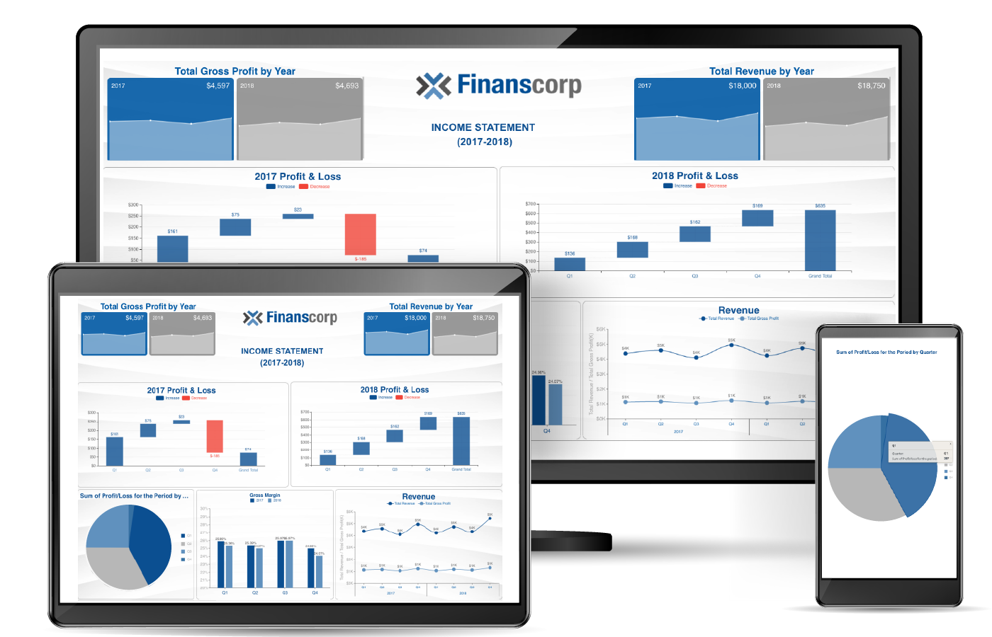
The Waterfall chart visualization shows the cumulative result of sequential positive and negative values. Typically, these values are categorical or time-based. This visualization is often used in finance to show how NET values are calculated from a starting value.
To create your own custom visualizations in WynDashboards check out the Create Custom Visualizations for BI Dashboards post here.
Understand the Story Behind Your Data
Wyn is a web-based BI and data analytics platform that provides greater insight into your data.
Wyn offers built-in tools for report and dashboard creation, data governance, security integration, embedded BI, automated document distribution, and a business-user-friendly interface for self-service business intelligence.
Test drive on your own data with our free evaluation.


