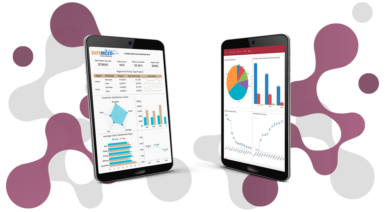
With BI dashboards, you can analyze data and deliver actionable information with multi-dimensional dynamic analysis, and intelligent drilling. Slice and dice business information and create ad hoc visualizations with drill-down, and cross-filter functionality.
Wyn Enterprise comes with easy-to-use designers to create, design, analyze and distribute your company’s data. You can easily customize the look and feel of your dashboard, or you can use one of our preloaded, built-in options.
In this video, we’ll show you how to customize Wyn’s built-in themes and palettes.
Using Themes and Color Palettes
To begin, you will need your brand's RGBA, hex, or CMYK codes.
Once inside the Dashboard, select "Document Settings" in the top menu bar. Scroll down to the "Document Appearance" section in the "Inspector tab."
Select the drop-down menu for "Themes" to find a gallery of preloaded and customized themes.
Customization
To customize this theme for your Dashboard. You can scroll through the "Document Settings" tab to set the global style for your Dashboard. You are not stuck to your choice; you can also customize each visualization.
Scroll down to the "Global Settings" section of the Inspector; this is where you can customize the palette to work better for you.
Select the "Palette" drop-down tab. Here you see our "Color Settings Tab." The three tabs within this panel are "Theme," "Standard," and Custom."
The "Themes tab carries over colors from themes. The "Standard" tab has preloaded popular color arrangements.
Lastly, the "Custom Tab" allows you to customize your selection. Under the "Custom" tab, click "Create New Palette." The colors of the theme you selected in the Document Settings tab will appear as default.
Notice the "Mode" drop-down menu. Here you have three options: "Custom Color" allows you to select a basic color palette.
Gradients
Under "Gradient Series," you can select two colors and have a palette generated automatically. Then, you can give your palette some depth for gradient color by making each swatch a gradient.
Click on the first color swatch, and the "Color Picker" will pop out.
Now, let's apply our custom colors to the palette. Let's use the solid color palette option, "Custom Color."
Select the "Custom" Tab.
Enter the colors information. Notice you can also adjust the opacity of a color.
Click OK, and then continue to the next swatch.
Once you have all of your colors worked out, click "OK" in the "Color Settings Tab" and go ahead and click "Save" in the top menu bar to save your changes.
You can also customize the palette you chose for individual visualizations if you want a different color to show up in a different way than other graphics.
Select the "Palette" drop-down under "Chart Style."
To change the background color, scroll down to the bottom.
Click "Save."
Now you can enjoy creating your dashboard with your own branded custom style!
Better Data Insights = Better Decisions
Let us show you how Wyn Enterprise can provide greater insights into your data.
Learn how to make data insights more attainable, actionable, and valuable. ↓


