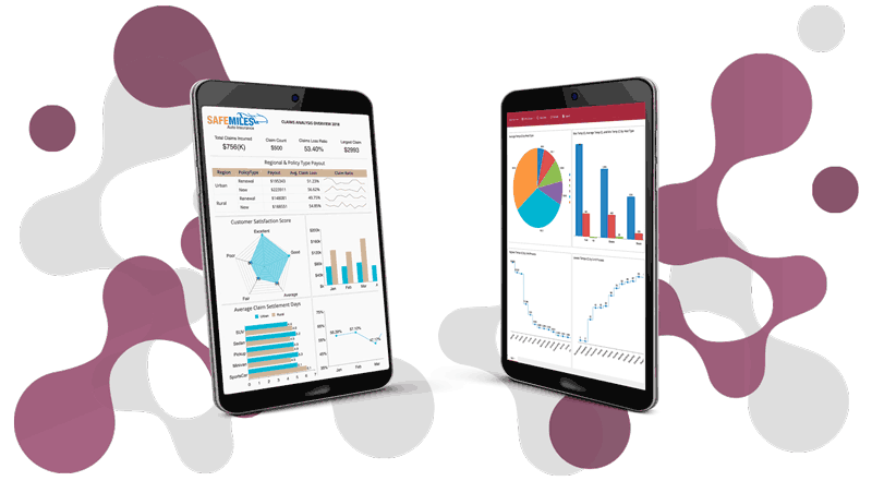
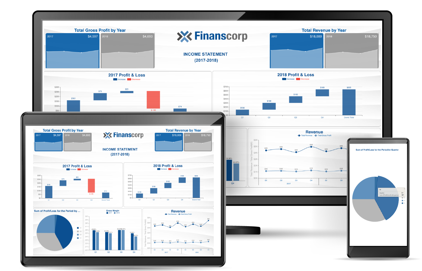
Wyn Enterprise v4.1 offers faster performance, more data sources, new data visualizations, custom charts, and more. With the release, we are excited to unveil a number of new data visualizations for meeting various use-cases in presenting your data.
New Data Visualizations
- Pareto Chart
- Network Diagram (Relationship Diagram)
- Quadrant Scatter Plot
- KPI Cards
- Box & Whiskers Chart
- Range Chart
- Waterfall (Custom Visual Download)
- Histogram (Custom Visual Download)
Read the full Wyn Enterprise 4.1 release.
Design-Time/Run-Time Improvements
Drop-down Slicers now support single value selection as the default behavior when the dashboard is run. Users can choose which items are shown in the Slicer if they do not want all values to be visible, and users can specify to hide null and/or blank values in any Slicer. The Data Table visualization now supports hiding the column headers. In the Data Table, values can also be specified to have their text wrap for easier run-time viewing. Data Tables also have the capability to allow users to \"quick filter.\" so that they have an Excel-like functionality to filter a column.
When building a long Jump To External URL, the text will now wrap for easier creation of the URL. Jump To settings can now be further configured to allow the target dashboard to change theme, language, and other document settings. Passing dashboard parameter values to a report's parameter values is now natively supported in Jump To expressions. There is also an additional Jump To mode, \"Redirect.\" This will change the URL from the Wyn server URL to the target URL when the Jump To is activated.
In visualizations with X/Y axes, sorting is now available when percentile calculations are being calculated/shown in the chart. The Image management dialog now has search functionality for easier selection of an image from a list of many options, and the Image source can now be external (from a database or URL).
Dashboard authors can assign specific palette color to specific data fields in charts, so that even when filtering is done, those fields will always be represented by the same color in any chart. Pivot Tables, Data Tables, and KPI Matrix controls now support Images.
Users can customize the font color of a scenario title without affecting the font color of all other text (e.g. axis labels) in the visualization. Users have the ability to expand the width of the page tabs so that if a page tab title is a long string, it will be shown in its entirety. All appropriate chart types now support \"Show Value As Percentage\" configuration to show a data point as a percentage of a whole.
 OEE Manufacturing Dashboard Using the Custom Wave Chart
Charts now also support aggregate grouping so that specified values can be grouped together as a separate single value (\"other\") compared to other individual data points. Users can collapse and re-order Dimensions and Measures in the Data section of the Dashboard Designer. Users can sort visualizations by fields that are not necessarily shown in that visualization. For comparing data across multiple Series/Category values, users can now click and drag across multiple values to display the respective tooltips for the selected values all at once.
Many enhancements to Data Labels and Tooltips come with this release, including position, styling, and displayed values (e.g. which fields are shown).
Users can now choose whether filtering is single-source or multi-source so that multiple levels of filtering can be applied by way of Slicers or Visualizations to affect other scenarios on the same page. Conditional Formatting additions have been included such as contain, <>, starts with, etc.
The Analysis Path functionality has been added to allow for custom analysis behavior on scenarios. This allows users to change visualization type, data binding, and other configurations of a single scenario when a drill-down on that scenario occurs. At run-time, users can change the fields being used in a visualization through the Data Binding adorner option. Previously, they could only change the aggregation and visualization type.
When a dashboard refresh occurs, and the user is on a tab other than the first tab, the refresh will not automatically revert back to the first tab.
Users now have a new button available at run-time to remove any filters on a given visualization that they had applied. This allows for easier and quicker data discovery at run-time.
Dashboard Datasets and Performance
Dashboard datasets now use MonetDB for the dataset cache, which inherently improves the performance of the dashboards at run-time. On multi-page dashboards, the contents of all tabs are loaded at the same time as the first tab so that there is a reduced load time when tabs are navigated between. Dashboard authors can now ensure that jump to target dashboards automatically refresh their respective data cache if the parent/source dashboard's cache was updated at the time it was open. Users can include information on their dashboard about when the dataset cache was refreshed last.

Integration
When integrating WynDashboards in your application, you now do not have to embed an entire dashboard. You can instead embed a single scenario/visualization as part of your web application using an iFrame. Slicers and Filters on the dashboards can be configured to accept values from webhooks to allow for more custom interactivity between external applications and the dashboard. The Dashboard Viewer and Dashboard Designer can now be embedded via DIV tag, so there is no longer a dependency on iFrames.
Understand the Story Behind Your Data
Wyn is a web-based BI and data analytics platform that provides greater insight into your data.
Wyn offers built-in tools for report and dashboard creation, data governance, security integration, embedded BI, automated document distribution, and a business-user-friendly interface for self-service business intelligence.
Test drive on your own data with our free evaluation.


