Interactive Map Visuals
On a dashboard, maps can help you to focus attention when viewing geographical data and make informed business decisions.

Maps in WynDashboards
WynDashboards provides several map visuals to support diverse location-based data analysis scenarios.
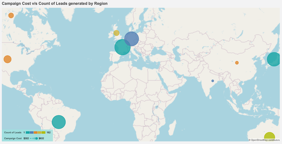
Bubble Map
A Bubble map employs size and/or color to show variations in measure magnitudes among different map points or regions. It's useful for metrics like regional sales, entity counts, and more.
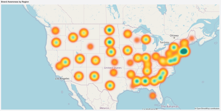
Heat Map
A Heat Map displays data on a map using colors to indicate high and low density areas. It measures data point density within a specific geographic radius.
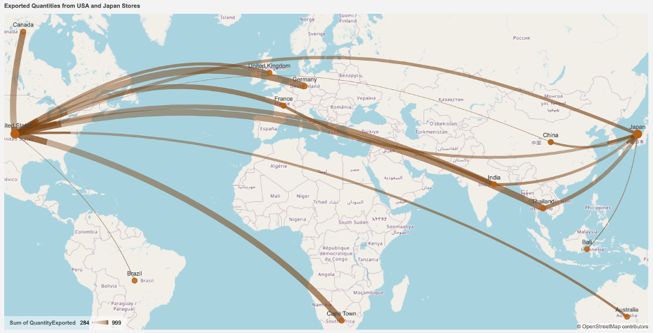
Flow Line Map
A Flow Line Map shows movement and measure magnitude between geographic locations, like commodity exports or item distribution. It employs color and/or size to represent the analyzed measure.
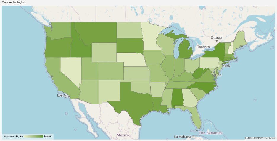
Area Map
Area Maps employ colors to visualize measures across geographical regions, highlighting significant areas such as those with high sales, low disaster impact, ample transport for manufacturing, and more.