Business intelligence (BI) plays an important role in modern commerce. It enables you to make strategic, data-informed decisions that increase profits and help keep your business competitive. You can use BI tooling to generate meaningful insights from raw data to identify market trends, find optimization and growth opportunities, and better understand your customers.
Businesses in the retail industry can especially benefit from implementing BI. Retail is an ultracompetitive industry that generates vast amounts of data daily. With a wealth of data points, you can use BI to gain a holistic overview of how your retail business is performing — a key advantage in this highly saturated industry.
But you need the right BI tool to get the most out of data. Wyn Enterprise is an embedded, real-time BI solution that makes it easy for you to turn your data into visually appealing and informative dashboards.
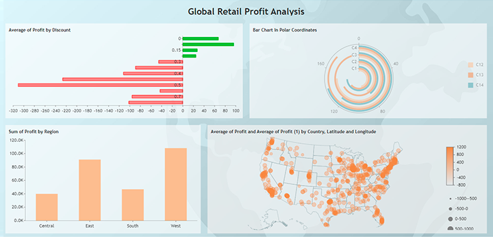
This tutorial shows you how to create customized visualizations for a hypothetical global retail chain. You’ll see how easy it is to create visual dashboards with Wyn Enterprise and how these dashboards help you gain insights into your data.
Visualizations for the Retail Industry
You’ll begin this tutorial by accessing a database with sample data for a hypothetical global retail company. Then, you’ll install Wyn Enterprise and connect it to the database.
You’ll then design a dashboard and explore various methods of visualizing different elements of the dataset, including revenue, sales, ship modes, profit, product category, and more.
Finally, you’ll learn how to sort these visualizations by geographic location, generating an in-depth analysis of retail performance.
Prerequisites
To follow this tutorial, you’ll need:
- A Kaggle account — Kaggle is a Google-run community for data scientists and provides numerous sample datasets, including the one you’ll use today.
- A Wyn Enterprise account — Your account will provide access to all of the tools necessary for visualizing your BI data.
Getting the Dataset
To build a global retail performance management dashboard in Wyn Enterprise, you first need a dataset to work from.
For this demonstration, download a sample dataset from Kaggle, a popular online community for data science and machine learning. The Augmented Superstore Dataset is a curated collection of geocoordinates. The data includes transaction records for a hypothetical global retail store. It holds information about profits, sales, and other relevant KPIs among cities, segments, and shipping modes.
The landing page for the dataset looks like this:
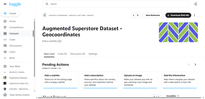
Next, click Download in the top-right corner of the screen to store the Excel file on your computer.
Now you’re ready to install Wyn Enterprise.
Downloading Wyn Enterprise
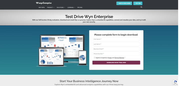
To download the latest version of GrapeCity’s Wyn Enterprise, visit the Wyn website, click Try Free in the top right-hand corner, and select the 30-day test drive option.
Once you complete the form, you will prompted to download Wyn onto your desktop. If additional install information, you can visit the Documentation section of the website.
Using the Wyn Enterprise Interface
Wyn’s interface comprises of three portals: Document, Resource, and Admin. Because you downloaded the software as an administrator, you have access to all three. Before creating visualizations, it’s essential to understand each portal and the features available.
The start page opens the Document Portal by default. It contains dashboards and reports, referred to as documents. From here, you can access all sample documents and those you’ve uploaded.
The Resource Portal displays all the resources available on the server, including data sources, datasets, and your data models. To access it, click on the block icon above the profile in the bottom-left corner, then select Resource Portal. This opens the following page:
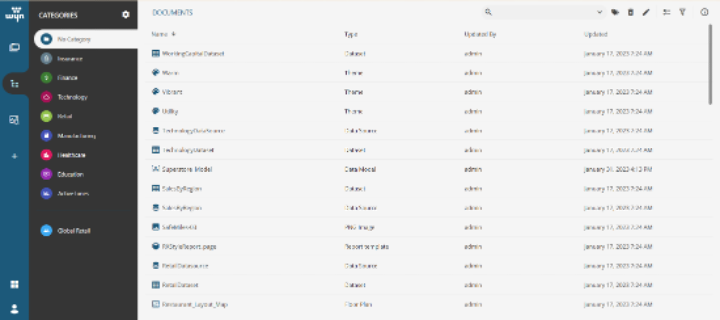
You can create new document objects, monitor your data, and review the existing categories here.
The Admin Portal is where you access information about and settings for configurations, security, your account, and all your documents. You can access it by clicking on the block icon and selecting Admin Portal. This opens the following page:
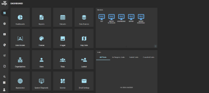
Now you’re ready to create a database and load the dataset.
Loading Data into Wyn’s Database
To load the dataset into Wyn’s database, go to the Resource Portal. Click + in the navigation menu and select Create Data Source. This directs you to the following:
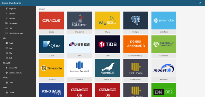
From this view, you can connect to existing data sources, upload files from your computer, and create new data sources from existing datasets. For this tutorial, you’ll connect to a database and load the dataset. Note that Wyn supports multiple data source forms, including big file formats, big data, and relational databases. This flexibility ensures that Wyn can be easily integrated with your own data source.
To load the Kaggle dataset you downloaded, select Excel on the left-hand menu. Then, name your data source and upload the file when prompted:
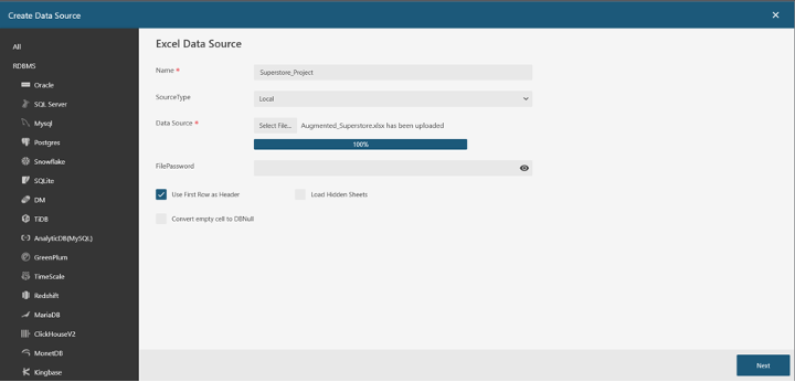
Now, click Next and select the Excel sheet that contains the data. Click Next again.
Before you create the data source, Wyn allows you to edit the columns’ data types and names by clicking on the names or dropdown menu next to each name. You don’t need to edit the data for this tutorial, so just click Create.
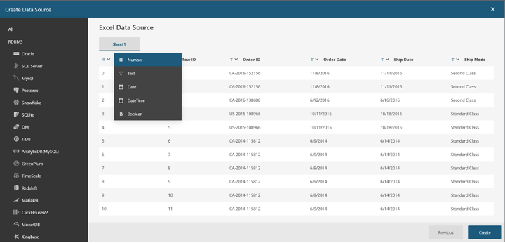
After the data source has been successfully created, it’ll render when you select the Data Source section in the left menu:
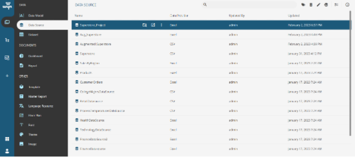
To make the data source available for processing and visualization, you can create a data model.
First, click + and select Prepare Data under the DASHBOARD section. Select Cached Model, which will load the following view:
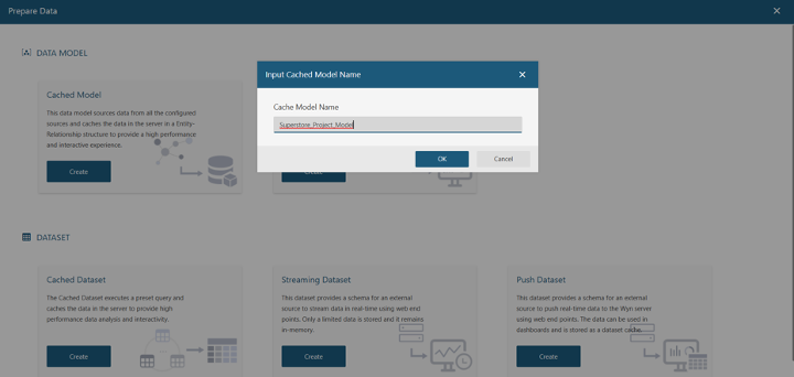
Name your model and click OK.
Then, click on Get Data at the top of the page. Select the data source you would like to create a model for. Next, select the Augmented Superstore dataset you just loaded and click Next.
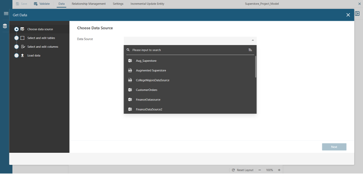
Give an alias to the newly created table if you’d like, then click Next:
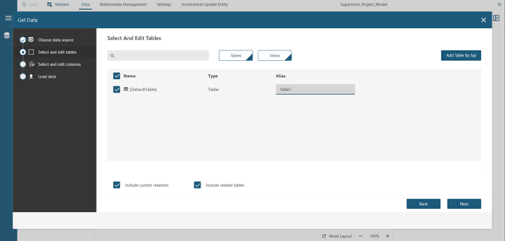
This will allow you to double-check the data types inferred automatically by Wyn and create aliases for specific columns. For this tutorial, you’ll use the default settings, so simply click Next until you reach the following view:
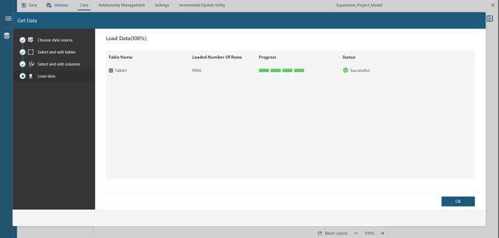
Now, click OK, then click Save located in the top left to save your work.
You’re now ready to create your visualizations.
Creating Visualizations
To start visualizing the dataset, go to the Resource Portal and click Create Dashboard, which loads the following:
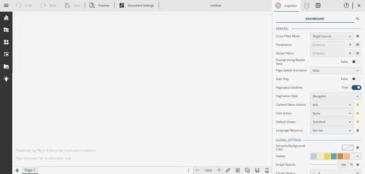
Wyn Dashboards display information through a series of interactive tiles that highlight selected metrics and trends from the underlying data. The Dashboards interface comprises three main parts: the sidebar, the Inspector tab, and the Data Binding panel.
The sidebar is where you find available visualizations, special components, such as rich text or maps, and data slicers. It’s also where you build your custom visualizations. Click on the top icon of the sidebar, and drag and drop the first option — a column chart — in the empty canvas.
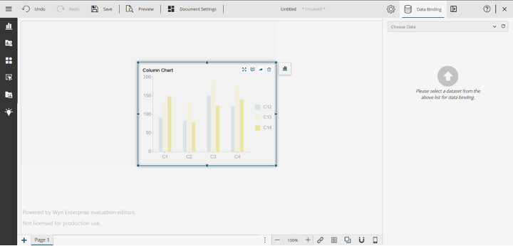
When you drag and drop the column chart, Wyn will recognize that you haven’t selected any data for the dashboard and will automatically open the Data Binding panel, where you can select your data source.
In the Data Binding panel, open the dropdown menu and select the data model you created. In the image below, the model is called “Superstore_Project_Model”:
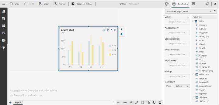
Now you’re ready to create your first interactive visualization!
Like any retail company seeking a competitive edge, the hypothetical retail company in this tutorial is looking to maximize profits. So, we'll now focus on conducting a detailed profit analysis by conditioning based on relevant dimensions of the dataset.
In the following steps, you’ll build your dashboard step by step, implementing features relevant to a retail company. You’ll build through each customization individually while gradually increasing the complexity of each visualization.
Visualizing the Sum of Regional Profits Using a Column Chart
Add data to your chart to build a column chart showing the total profits by region. Profit is a numeric variable that you can drag and drop into the Values box. Next, drop the category variable Region in the axis by dragging it there (Category). Vertical bars indicate how the profit for each region is displayed on the final graph:
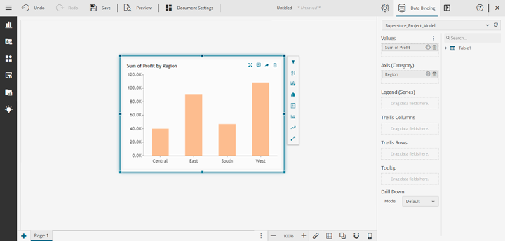
Note that the values are automatically aggregated. You can use this graph to compare the profitability of several regions and determine which ones are most profitable for your company. This graph allows you to quickly see trends and patterns in your data and make business decisions.
Visualizing the Average Profit by Region Using a Polar Coordinates Graph
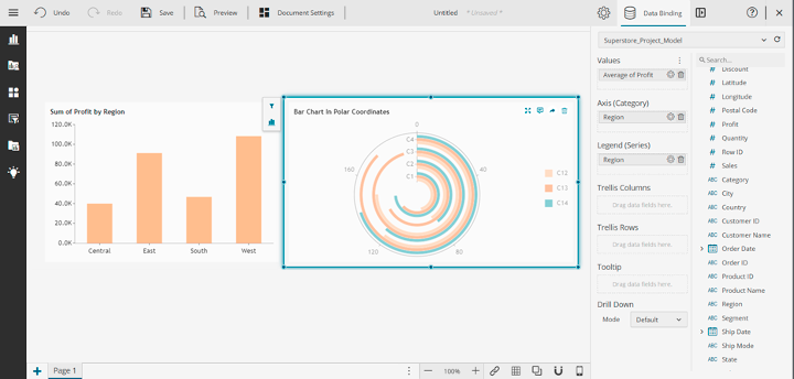
Wyn offers several kinds of aggregation functions, including a bar chart in a polar coordinates system. To visualize the data in this way, select the bar chart in the polar coordinates icon located above the scatter plot icon.
Drag the variable Profit to the Values box and the variable Region to both the Axis and Legend boxes. Wyn assigns colors automatically.
To change to average aggregation, click the configuration icon next to Sum of Profit under Values, and select Average from Aggregation Method. This enables quality exploratory data analysis for a high-quality retail performance dashboard. Then, give your dashboard a relevant name, assign it to the category of your liking, and save your progress:
Then, add a title to your dashboard using the Rich Text component located in the sidebar's third icon from the top. The Rich Text component allows advanced formatting and dynamic text insertion. Name it "Global Retail Profit Analysis." Double-click on it to edit the text and customize it as desired.
Visualizing the Impacts of Discounts on Profits Using a Bar Graph
Next, use a bar chart to visualize the effects of discount offers on profit. Drag and drop the Bar Chart component from the charts section in the sidebar into your canvas. Then, drag the Profit variable into Values, select Average as the aggregation methods, and drag the Discount variable to the Axis box. Here’s your expected result:
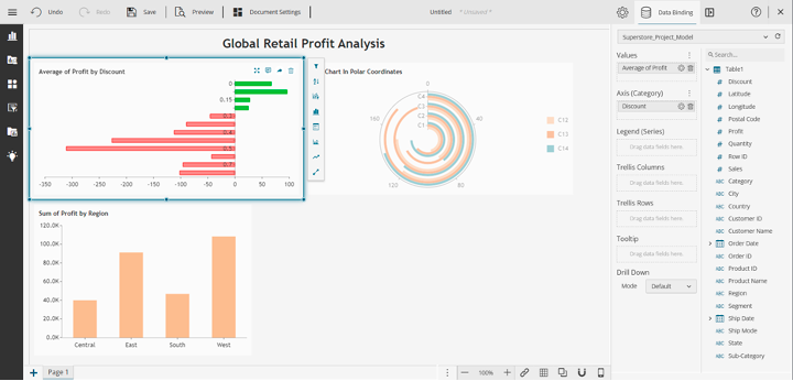
The bar chart shows there are negative profits for discount values above 20 percent.
Because this is a relevant, actionable insight, you should highlight the information using conditional formatting, which can create a more compelling visual story. Conditional formatting helps you emphasize particular information and draw visual attention to insights based on specified conditions.
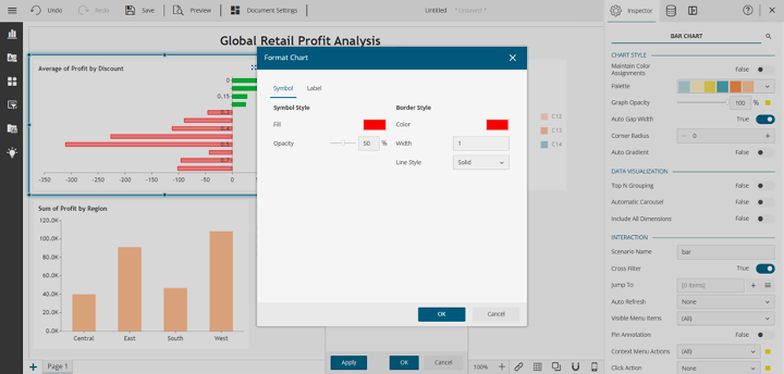
To add conditional formatting to your bar chat, click on the chart. On the pop-up menu, click Conditional Format, the fourth icon from the bottom. In this menu, add a conditional format to color the negative values with red and the positive values with green. This coloring makes it easier to visualize the negative-to-positive profit ratios.
Select the average profit as the target value and the Less Than condition. Since you’re interested in negative values, compare the average value to 0. Finally, click Style and choose red to fill the bar and its borders, selecting a value of 50 for opacity to support readability. Note that the filled bar may overlap with the y-axis labels. Then, click OK and apply the format to the chart:
Follow the same process to color the positive values by selecting green as the color and condition based on the average profits that are greater than 0.
Visualizing Profits Across Geographical Locations Using a Map
To finish your work on the first page of your dashboard, drag a Map component from the Charts subsection called Maps and drop it in the canvas. Add the variable Country to Region and the variables Latitude and Longitude to their respective boxes.
Next, drag and drop the Profit variable to both the Size and Color boxes under Points, specifying the average aggregation method. The map should look as follows. Note that for demonstration purposes, the location and size of the scenarios have been adjusted for a cleaner look:
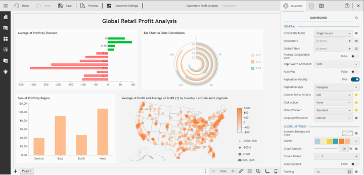
It’s difficult to appreciate the differences in average profit per location with this color. To create a clearer, more impactful visualization, you can customize the map through the Inspector tab. Click on the map and scroll down to the Points section under the Inspector tab. There, change the base color to something with greater contrast, like orange, and add a legend by setting Show Legend to True.
The result is a much cleaner graph that facilitates location-based segmentation. It’s a powerful visualization technique to understand the performance of your retail across metrics and locations:
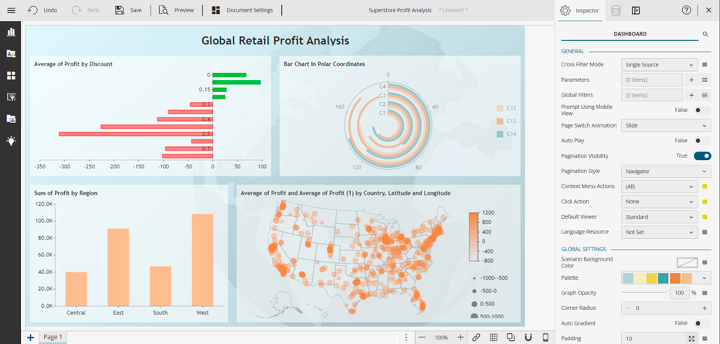
Hover over the map and expand it to full screen. The chart is interactive, so it shows relevant data points as you hover over different locations.
Conclusion
BI is important in the retail industry due to the large volumes of data generated daily. In addition to big data, retailers often deal with diverse data sources such as sales transactions, inventory levels, customer behaviors, and market trends. With the right BI tools, you can analyze this data to gain insights that help you make informed decisions.
You can access, analyze, and visualize data rapidly by using BI tools like Wyn Enterprise by GrapeCity. They give you a comprehensive overview of your business operations, allowing you to identify patterns and opportunities for optimization and growth. By creating customized visualizations and interactive dashboards, you can track key performance indicators (KPIs) and monitor your business performance efficiently.
Learn more about retail data visualization with GrapeCity and Wyn Enterprise.


