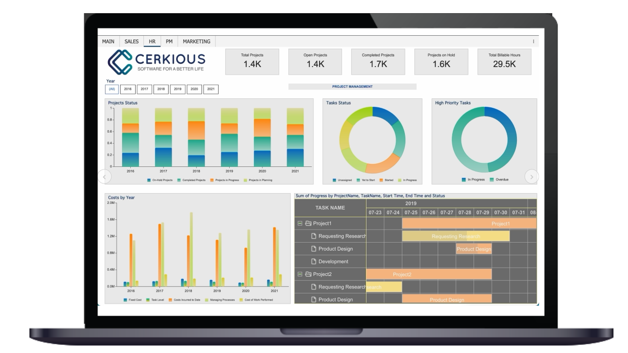
Typical dashboard design includes several dimensions within a single snapshot of visualization, for example, Charts, Data Tables. These visualizations when combined make a meaningful dashboard. Such a dashboard design is suitable for business situations where the analysis is to be made in its entirety - for instance, Revenue Analysis, Web Analytics, CMO dashboard, and many more.

Image showing a typical dashboard design
However, certain business dashboards demand analysis to be made using the same KPI instance(s) for each dimensionunder study. Such dashboard designs are often used to correlate, compare, and contemplate information for multiple dimensions simultaneously, for instance, an IT Server management dashboard that visualizes the metrics such as uptime, downtime, load handled, etc., for several servers together at the same time, in the same screen space. Other examples include a Production Line performance Dashboard, Stock Portfolio Dashboard for different companies, Student performance, Scorecards, and many more.

Image showing dashboard with same KPIs for multiple dimensions simultaneously
Wyn Enterprise 6.0 introduces new Card Chart visualization that allows designing a flexible, adaptive, and interactive dashboard layout to meet the above analysis requirement. It offers to design the KPI(s) card so that the context and the story behind a measure can also be shown along with the number.
In this blog, we’ll look into this new dashboard visualization and how to build it taking the help of a simple Store Performance dashboard as shown below:

Adding Card Chart Visualization to the Dashboard
You can find the Card Chart in the Data Visualization’s Charts section. When you drop the card chart on the design page, you see the button to edit (or design) the card template on the Card scenario, as shown below:

Preparing the Card Template
Clicking the “Edit card template” button on the Card Chart scenario opens the Card Template Designer.

It offers to add most of the visualizations supported by the dashboard designer except the visualizations such as CalcChart, Multi-Source charts, Slicers, etc. This is because these visualizations serve specific analytics purposes and their functions are unsuitable for visualizing by the Card Item. The data visualization in a Card is known as Card Item Scenario.
For this blog sample, we added RichText and Pivot visualization on the card to show the aggregated information for Revenue and Quantity, as shown below:

Binding Data and Category to the Card Chart
Data binding for a Card Chart can be done from the dashboard design page or from within the Card template designer.
On the right, you see the usual data binding panel to select the dataset for your analysis. The panel offers to set the Category and Tooltip for a Card Chart. Select the data field (or dimension field) from the dataset as the Category to generate the Card Items for one or more values.
For the sample in this blog, the Card Chart is bound to a retail dataset based on Constoso Database, and the dimension “Store_Name” is selected as the Category field. This will generate the data visualizations added to the card in the previous step for each of the Stores in the database.

After binding data to card item scenarios, the card looks as shown below:

Configuring the Card Items
Once the card template is ready, you want to decide how these card items must appear in the preview of the dashboard. Configuring a card item’s layout is possible using the several properties available for Card Chart in the Inspector tab on the right. These properties can be set from within the Card Template Designer or by selecting the Card Chart on the dashboard designer.

Some of the key properties of the Card visualization include:
-
Interaction Mode: Controls how the interactivity should be configured on the card item.
-
Card Item Styles: Defines the styling of the card items for different events such as card selection and mouse hovering.
-
Card Item Layout: Decide how the card items should appear in the preview. It includes settings such as Item count per page/line, Flow direction, etc.
The sample card chart after applying the Item count, pagination, and styling configurations such as highlighting the selected card item and hovering card style, in addition to other settings like Theme, appears as shown below:

Learn more about these configurations and other data formatting options from the documentation page.
Configuring Interactivity on Card Items
Since the cards present aggregated numbers, you want to see a deeper context associated with them. This can be achieved by enabling interactivity on the card chart.
The interaction can be within the same dashboard using configurations such as Cross Filter, Drill Down, Tooltips, Keep/Exclude metrics, etc. And it can be outside the dashboard, to a report, or another dashboard, using the Jump configuration.
The Card Charts offers two modes to apply interactivity to a card item:
-
Interaction on Card item: Use this interaction mode when you want to change the context of your analysis on all the KPI cards. Here, the interaction settings from the Card chart are used.
-
Interaction on Card Item Scenario: Use this interaction mode when you want to change the insights within a KPI card. Here, the interaction settings from the card item scenarios are used.
In this sample, we have added a card item drill-down to “ClassName”. When a card item is drilled down, we see the context information on the card changes. It then shows the sales data for each product class within the selected store as shown below:

Conclusion
Card Charts are highly flexible to adapt to different layouts and designs. Interactivity and the ability to conditionally filter values make it more powerful. Try out this new chart type for business situations where simultaneous monitoring or analysis of different entities is needed.


